5 Ways Nonprofits Block Online Giving

Use Best Practices to Boost Conversions
Here at Abeja, we believe in the integrated fundraising campaign. These campaigns produce the most revenue by mixing the best that traditional and digital tactics have to offer in a potent cocktail.
A basic integrated campaign consists of a:
personalized donation letter,
a series of support emails, and
an optimized donation page.
This blog is about that last component — the optimized donation page — because the task of measuring and improving these pages often falls to the bottom of nonprofit to-do lists.
Donation page conversions low
The average conversion rate for a main donation page sits at just 17%, according to the 2022 M+R Benchmarks report.
In other words, 83% of the traffic that nonprofits worked hard to get to
their donation pages didn’t give.
Of course, this is an industry average, and your mileage may vary. As I’ve mentioned before, it’s easy to calculate and actively monitor your conversion rate over time using your website analytics data. Here’s the formula:
Conversion rate = # unique donations / # unique visitors to page
(I’ll save the topic of whether your fundraiser has easy access to website analytics for another blog.)
Nonprofit websites serve the needs and wants of many internal audiences. And when fundraising isn’t the top priority at an organization, that internal struggle certainly shows up on the website.
Here are 5 ways nonprofits block donors from giving online:
1. They hide the donate button on the home page.
A wise person once said that the donation button should be “big, bold, and above the fold.” If you’re that digital sensei, let us know so we can attribute the quote to you.
Let’s dive deeper into that idea:
Big: CARE and ASPCA have multiple calls to action on their websites. But as you can see in the examples below, none is as large or well-positioned as Give Now and Donate. If you’re 65, the average age of a U.S. donor, you can probably spot these buttons quickly.
Bold: A good donate button is a bright color that stands out. Test red, orange, or hot pink to see which works best for you. It amazes me how many well-meaning branding consultants talk nonprofits into a muted color palette that contains no colors that are useful for fundraising.
Above the fold: This idea started with newspapers, my first career love, which are physically folded to fit in newsstands. Only the top half of the paper is visible to passers-by, so journalists put the most attention-grabbing content there. In website terms, this means putting priority content near the top so the audience can see it without scrolling.


Now compare those donate button treatments to that of these real, but anonymized examples

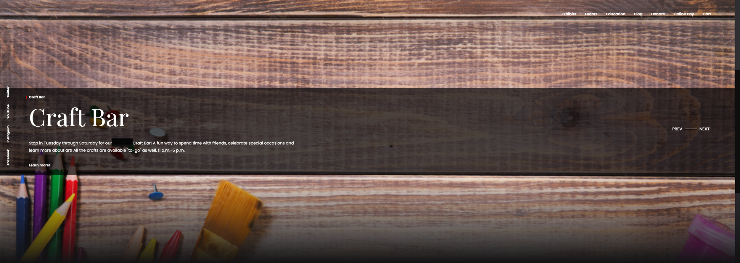
You can see that these organizations do not make their donate buttons big or bold, though there are donate links (if you hunt for them) above the fold.
Another thing to keep in mind when placing a donate button is the serial position effect. Research shows people tend to remember the first and last elements in a series better than those in the middle. That’s why most nonprofits follow the best practice of putting their big and bold donate button last (extreme right) in the main navigation menu.
2. They include the website’s header and footer navigation on the donate page.
When someone arrives on your donate page, you want them to do one thing: make a gift. You do not want them clicking off to look at other content.
Your content management system should give you the option to remove your website’s header and footer from the donate page. That removes distractions and makes for a cleaner landing page for your campaigns.
See how focused the above-the-fold experience is on The Sophia Way donate page with the main navigation removed?

Now compare that to the above-the-fold experience of this anonymized site below. You will note there are at least 25 links that urge the donor to abandon making a gift rather than scroll down to the very long donate form.

3. The donor form contains too many options.
Intuitively, it may seem like a good idea to present your donors with numerous options. Things like make a tribute, get a company match, explore legacy giving, donate with stocks, crypto, etc. Along the same lines, I know one nonprofit that lists 10 gift amounts on their donate page. Here’s what that looks like:

This particular donate page is a catch-all because the organization doesn’t communicate often enough with donors to segment their appeals. But they’re working to change that!
Presenting many options ensures donors get exactly what they want, right?
The research shows the opposite. Too many choices cause anxiety and unhappiness, an observation psychologist Barry Schwartz covered in his 2004 book, “The Paradox of Choice.” And those negative feelings may cause donors to bounce off your page.
Best practice followers like CARE and ASPCA usually present donors with just three choices:
Gift type: one-time or monthly
Gift amount: A limited string of 5 ask amounts, plus “Other”
Transaction fee: A chance to cover the credit card fee
I say usually because they add one element from time to time as a test to see if it boosts and detracts from donations. We also have a client testing whether shrinking the gift string to just 3 options, plus “Other” changes giving habits.
Bottom line: Fewer options keep a donor focused on completing their gift. Once that’s done, you should follow-up with year-round communications that thoughtfully cycle through other options, such as monthly and planned giving.
4. They use descending gift strings.
Conventional wisdom is that a descending gift string — $1,253, $607, $311, $109 — will discourage donors. They see the large amount first and get sticker shock. Then they see their usual gift amount listed last and they feel like a cheap skate.
In the same thinking, an ascending gift string has this effect:
$109 “Yes, that’s about my usual amount.”
$311 “I can probably swing that.”
$607 “It’s a been a good year. Maybe I can be extra generous.”
$1,253 “Wow! That’s too rich for my blood right now.”
I haven’t seen any definitive research that bucks conventional wisdom, yet. But if you design a statistically significant A/B test of gift string order, or you want to, definitely give me a shout.
5. They fail to provide decision stage content.
I see a lot of distracting content on donate pages. Too many pages give would-be donors added homework to complete in the form of watching videos, reading FAQs, and reading organizational histories.
Instead, they should briefly reassure donors that they’re making a sound decision by giving. Good decision stage content removes last-minute donor objections that may spook them from completing their gift.
It puts questions to rest like:
Is this a real nonprofit? Use 501(c)(3) statement with EIN number (In Arizona, add qualified charitable tax credit number)
Is this a reputable nonprofit? Use seal from third-party validator like GuideStar or local Chamber of Commerce
Is my gift tax deductible? Use brief boilerplate that gifts are deductible to the extent allowed by law
Is my personal information secure? Use CAPTCHA, Norton seal, or a give button that says Give Securely
Can I give by mail or phone instead? Use mailing address, phone number, and development email address for lingering questions
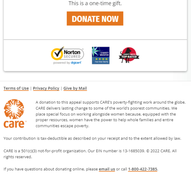
Best practice websites put this information after the donate button in the form and/or they replace the website’s usual footer with these reassurances. Here’s the CARE lockup for reference.
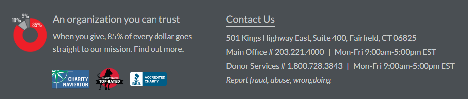
If your nonprofit’s overhead rate is part of your value proposition, then this lockup from Save the Children may inspire you.
A growing number of donors are choosing to give online rather than write a check. According to Blackbaud, online giving made up 12% of all fundraising revenue in 2021.
Just think how much higher that number could be if more nonprofits measured the performance of their donate pages and made it as easy as possible to complete a gift.
You Might Also Like
5 Donation Page Fixes to Make Before Giving Season