5 Donation Page Fixes to Make Before Giving Season

How Small Changes Can Produce a Huge Payoff for Your Nonprofit
Online giving is a small, but growing source of revenue for most nonprofits.
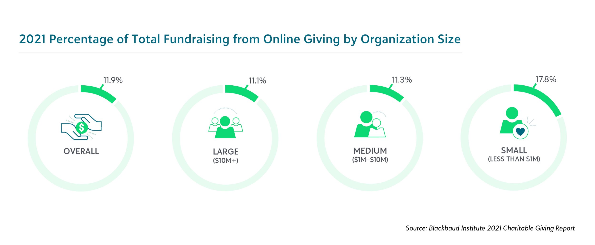
According to Blackbaud, the average nonprofit received 12 percent of its total fundraising online in 20121. Small nonprofits, those with revenue under $1 million, earned the highest percentage of their donations online: 17.8 percent.
While traditional fundraising tactics like donation letters and events still bring in more money on average, it’s important to make it as easy as possible for donors to give online. And that means having a great donation page.
Ahead of fundraising season, it’s important to review the state of your donation page. Here are five common issues I see often and how to fix them.
1. Your donation page is too generic
Branding tells a story about who you are and how your values match that of the donor. In short, a branded donation page builds trust and confidence. So don’t forget to brand your donation page, one of the most important stops in their journey with you.
By brand I mean a strong, yet brief statement of how donors are changing the world by partnering with you, not just your logo. A stunning photo will add personality and remind folks of your mission, too.
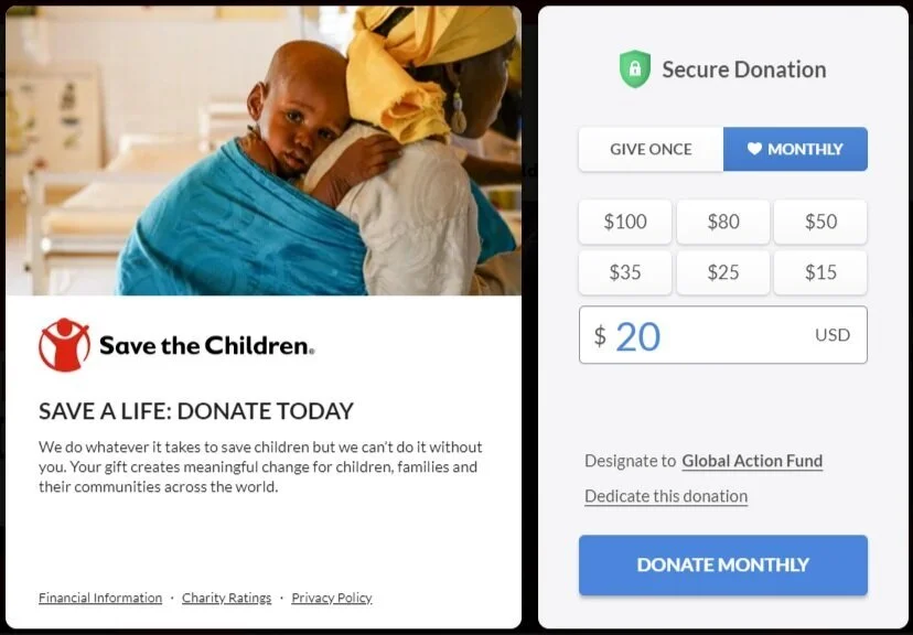
Save the Children makes good use of space on their donation page by including a photo, logo, call to action, and two sentences that reinforce the donor’s decision. And if you leave the page without donating, that triggers a small animated pop-up that asks you to complete your gift.

2. Your donation page has too many fields
Year-end fundraising is about covering your annual budget, not about collecting information. You can do that later with a clever welcome series of emails that reinforces their decision to give. So for fundraising season, consider cutting back your donation form to the bare essentials:
gift amount
monthly gift option
first name
last name
email
credit card number
expiration date
CVV number
street address
city
state
ZIP
All in all, that should be 12 boxes to click or fill in. The only potential exception might be a pre-checked box that suggests they cover your credit card processing fees. That’s becoming standard on donation pages.
Small nonprofit Beautiful Feet Ministries does a nice job of ensuring that donors only have to enter their name once on their form, under billing information.

BONUS TIP: I still see some nonprofits requiring people to create donor logins with passwords before they give. Please remove “stoppers” like this that could prevent some donors from giving.
3. Your donation page doesn’t suggest a gift amount
Most donor management systems will allow you to highlight a suggested gift amount. Research suggests that these default amounts do indeed increase giving. Choose an amount tied to a specific outcome that can make the donor happy, such as saving a pet’s life.
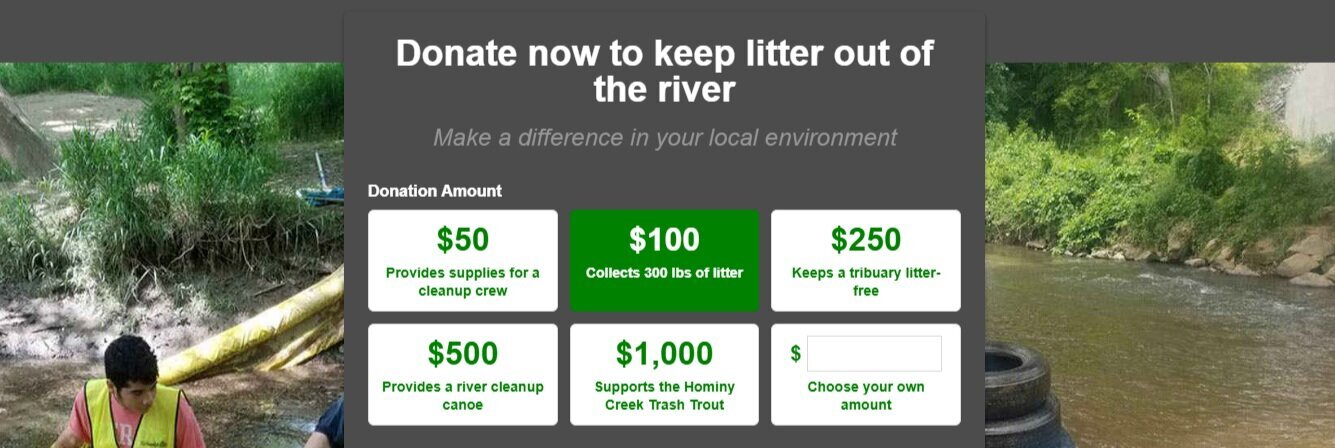
Look how Asheville GreenWorks is tying gift amounts to specific changes in their community.
Another great strategy is to use social proof. See how CARE suggests that “most people are donating $250 right now?”

In general, people like to follow others and adhere to the norm. Tests that used social proof found that revenue increased by as much as 34 percent!
BONUS TIP: There’s research that suggests that arranging your gift amounts from low to high increases revenue. But going from high to low decreases revenue by 25.2 percent. If that’s you, fix your page now before fundraising season gets underway!
Also, don’t include small amounts like $5 and $10 in your ask string. People can fill in those amounts in the “other” box.
4. Your donation page requires multiple clicks
65 percent of organizations surveyed admit that they require donors to click three times or more to complete a donation. Simplify the process to one click to increase conversions.
The Sophia Way’s donation page is beauty in simplicity. It takes one click to get there from the home page and one click to complete. Bravo!
BONUS TIP: The Sophia Way’s website favicon, a two-tone blue heart near the web address, transfers to their donation page. Some smart person went into their Blackbaud software and made sure that The Sophia Way favicon, not Blackbaud’s, showed up on their page. This plus a URL that starts with https: next to the lock icon makes the donor feel confident that the site is related and safe.
5. Your donation page isn’t mobile friendly
Take out your phone now and navigate to your home page. If your website is responsive, then it should automatically resize for your smart phone. You don’t want people to have to pinch and expand to make their donation.
Do you immediately see a donate button or do you have to scroll, or worse yet, access a drop down menu? Could that donate button (not just a link, please) be bigger for those of us with fumble fingers? And is it an appropriate contrasting color from the rest of the site?
BONUS TIP: Consider temporarily removing other calls to action like “volunteer” or “become a member” during the last few weeks of December. Over 30 percent of all giving happens in December, so it only makes sense to clear that path as much as possible.
Now when you click that donate button, does it take you immediately to a one-page donation form? Or are there multiple clicks?
The branded text on your donation page should be short and to the point. Images should be small, stacked, and not require you to zoom in to see them. Can you start completing your donation in one page scroll or less?
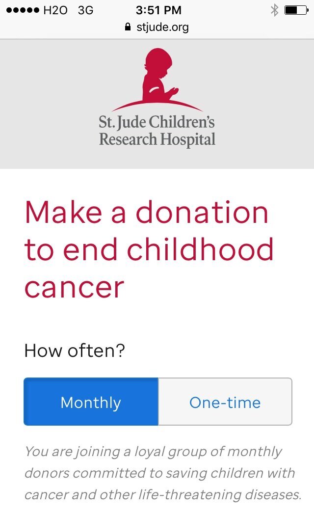
St. Jude Children’s Research Hospital does an excellent job of keeping its smartphone donors on task. I like the custom message that monthly givers receive, too.
BONUS TIP: Remove most website navigation from your donation page. People should be able to click on your logo and return to the home page. But if you’ve done a good job with branding, they don’t need access to any secondary pages before giving.
It’s easy for nonprofits large and small to get busy and forget about their hard-working donation pages.
But with a few quick fixes, you can create a better online experience for your donors and boost your bottom line, too.